

It seems that no matter where I end up I walk around and find public art/graffiti that I really love. This painting took up the whole side of a building and you can see that it wasn't a "spray and dash" initiative but a work that took time and no little measure of skill and good taste. I was amazed when I saw it as we drove by in the dark on our first morning, coming into town. I despaired of ever finding it. But one day I slapped on fresh boots, lots of warm clothes and a micro four thirds camera and went hunting. I must have a nose for it because I seemed to head straight to the part of town where this wall art lives. There was more. I'll show it later. This seemed just the sort of photography that actually calls for a wider view so I made use of the 15mm Leica/Panasonic lens and was happy to have brought it along. The weather is hard on outside art in Iceland. Just about the opposite kind of damage that the harsh sun inflicts on the Texas versions.

My fascination with doors and doorways began back in 1985, the first time Belin and I headed to San Miguel de Allende, Mexico. The doors there were more gothic and primitively finished and have been the subject of many photo essays over the years. I'm not familiar with a similar collection of door photographs from Iceland but these two door in a central neighborhood in Reykjavik just called out to be photographed. I tried to be very careful to get and keep my verticals straight up and down, and in the final image I may crop out the railing on the left of the frame. I used the square aspect ratio that the G9 provides, not because I am incapable of cropping, but because I wanted to make sure I got what I wanted the first time around. I guess it's some kind of wacky attempt at proto formalism.
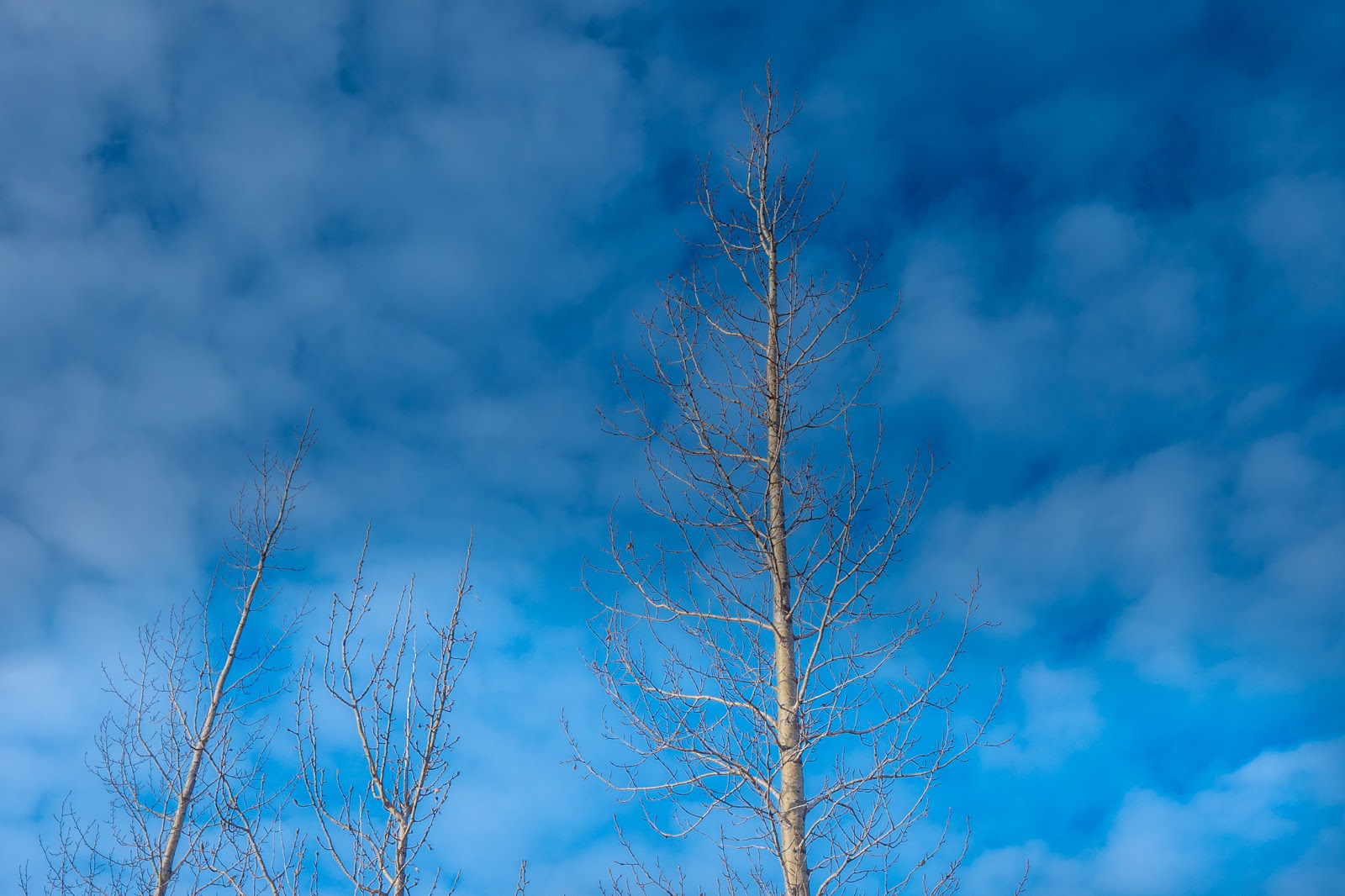


The image just above was one of my many efforts to get layers of depth into my landscape photographs. I'm sure if I had used a larger format it would have been much easier to have parts of the image out of focus. But I'm pretty sure that's not what I was going for....


I loved that there were buildings with red and blue roofs in the lower middle of the frame. It was my attempt to show the scale of the mountain in the background. I couldn't resist keeping the white fence in the foreground. I realize a technique that's new to me and then I become like a dog with a bone and try to overlay that technique on everything I shoot... Tragic. Sad. Fun.


I'm waiting for my VSL group critique of the landscape stuff. It's all new to me...
9 comments:
I love these images, Kirk. They have, what's the word? an elegant minimalism to them. If these were short stories, they would be Hemingwayesque, an adjective which implies power but also direct simplicity. Okay, I'll repeat myself: I love them. A small side-note: many years ago, a photographer whose work I admire, Tyler Monson, did a photo series in Iceland, of a trip to Reykjavik, of almost nothing but doors. And more doors. And more doors. I go back and look at it occasionally. Yours I hope to revisit again, for their own reasons. My props to you.
Nice pictures, but I think you mean "alternative"
Iain
Well, I can't see why you say you're not good at photographing landscapes!
Ever so often when I look at some "landscape photographer" website, I see photos where some added effect dominates just enough to make the landscape less visible.
I prefer honest landscape photos - unless the additions emphasize the landscape, which is rare indeed.
I *do* like your selection in this post, very much!
#7, on the black sand beach, has a 3D look, could be a setting for the next Star Wars film.
I always wonder when I am photographing graffiti and street art... am I appropriating this artist's work? Promoting their work? I dont have a good answer. For similar reasons I seldom photograph in a museum. Plus chances are, someone else has already photographed it under controlled circumstances,etc. I guess I just wondered what your thoughts are. Obviously the colors and textures reach out and grab you.
My criteria for good landscape images: how long do I stare at the photo? Simple. My eyes want to travel across the frame to take it all in. Your landscape photos catch and hold my eyes. Et voilà!
I will refrain from the usual "these are great, Kirk" or "I love them" etc. The pictures are fine. I especially love human/nature interface landscapes. But the compositions are kinda flat (which I think you previously alluded to) with the human elements and natural elements in a fairly normal balance (meaning what we might see from the car or side of the road or similar vantage point. If I were to suggest some strategy to make them feel different, I would suggest pushing the balance sliders closer to the extreme ends. Exaggerate one element without losing the context from the other. Changing perspective is a pretty powerful tool.
Ah, doorways. I also love them. This was one afternoon walking around the French Quarter in New Orleans with a 12-24 Sigma on a D700, set on 12mm:
http://www.epr-art.com/galleries/c3/
Layers of depth. Athentech Perfectly Clear helps, based on x-ray visualization technology that exposes pixels individually as the human eye sees them. Remarkable but natural results.
Post a Comment